Fixing flaws in website design with flat 2.0
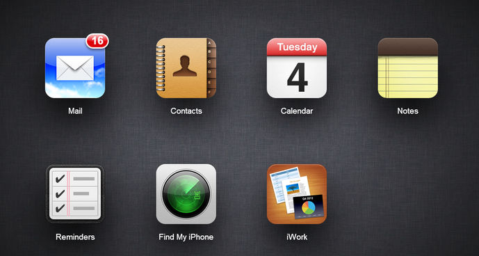
Many people are already familiar with the concept of flat design, they may just not know it yet. Flat design can be found everywhere from iPhones to Windows 8. The design trend came about in an attempt to make user interfaces easier to navigate with minimalist design. The original flat trend was a response, or some would say a rebellion, against what was hugely popular around 2011: skeuomorphism. In other words, everything in design was trying to imitate real life. Think of all of the menus on your old smart phone or tablet with 3D effects and glossy buttons hovering over a background. Prior to 2012 Apple was one of the biggest proponents of this approach with its tablets, phones and website design.

This all changed in 2012 when Apple released their new iOS and the rest of the internet followed suit. Everything became flat and minimal in an attempt to simplify and it worked — the minimalism is easier for users to navigate. This was all well and good but in the transition to flat design a few key things were left out.
- Raised elements let users know that they can be clicked
- Sunken or hollow elements let users know that they can be filled with information, for example search fields
At IPiece we use flat website design 2.0 to solve these problems. In fact, the updated IPiece homepage is a great example of flat 2.0. Some things appear over others to make them “pop” and emphasize their importance. The minimal design is still there but not everything is flat and lifeless. There are still elements of 3D interface but with a simple and easy to use feel. We use flat 2.0 trends to keep your website current and accessible to all of your clients.

The world of website design changes quickly. New trends come and go, but IPiece’s goal is quality and usability. With expert web design, we ensure your website looks great and maintains an intuitive, easily navigable format.